
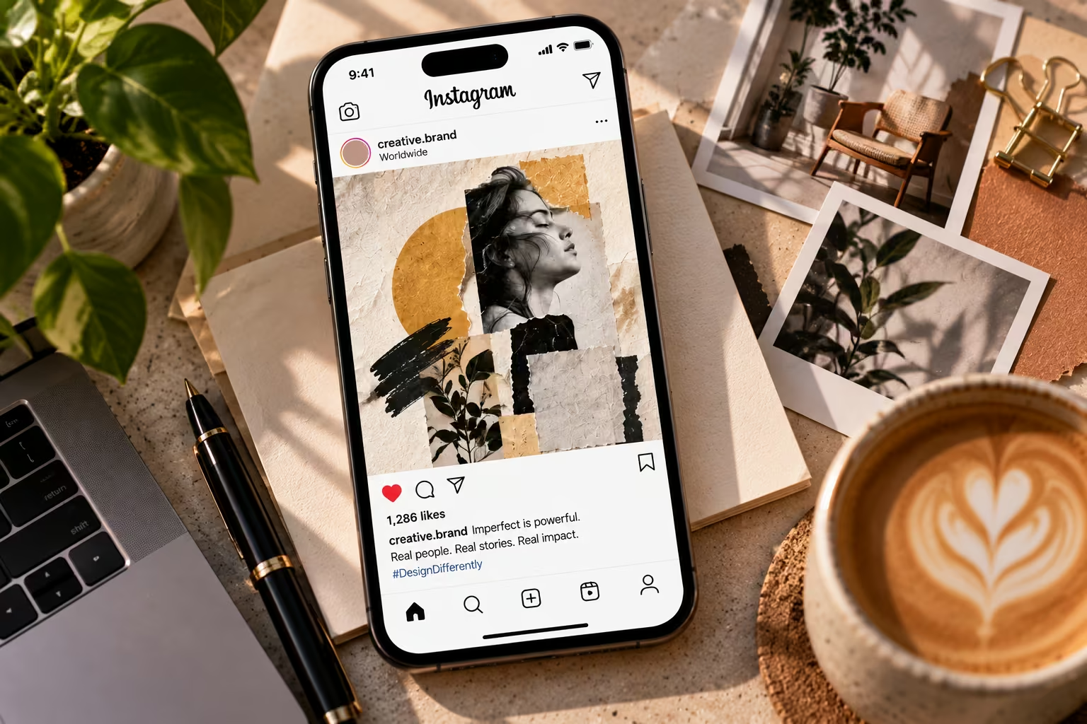
The frictionless "AI look" is now familiar: immaculate gradients, generic people, centred compositions, no trace of a human hand. In 2026, brands are answering it with candid photography, tactile texture, loose annotation, uneven crops and expressive type.
The short answer: keep the communication system precise — logo use, hierarchy, contrast, spacing, message — and add one or two controlled human signals. Imperfection should reveal personality, not create confusion. A hand-drawn mark can feel approachable; an unreadable headline still fails.
The trap is that imperfect design is easy to imitate and hard to control. Looking handmade takes more discipline than looking clean, not less.
What is the imperfect design trend?
It's a visual approach that preserves selected signs of process, material or personality instead of polishing everything into uniformity: paper grain, imperfect ink, irregular lettering, spontaneous photography, visible edits, asymmetry, collage.
Canva called 2026 the "Year of Imperfect by Design," based on platform activity and a survey of 1,000 creators. Adobe's 2026 forecast points the same way: a more digital environment is driving demand for organic, analogue, human-centred visuals.
It helps to name the dialect you actually mean, because they carry different brand signals:
- Textured and analogue — paper grain, ink bleed, risograph, halftone. Warm, crafted, small-batch.
- Expressive typography — bouncing baselines, uneven spacing, hand-lettering. High personality, high risk.
- Neo-brutalism — hard borders, raw structure, clashing colour. Direct and unsentimental; common in software and fintech.
- Collage and scrapbook — layered cut-outs, tape, torn edges. Strong in events, music and youth-facing brands.
- Low-fi photography — direct flash, motion blur, phone-shot framing.
- Handmade motion — stop-motion, frame-by-frame, imprecise easing.
Choosing "imperfect design" without choosing a dialect is how a brand ends up with six unrelated styles in one campaign.
The trend is not universal.
Consumer brand design is getting rougher, but interface design is moving toward depth and polish — Apple's Liquid Glass being the clearest example. Your marketing surfaces and your product UI may legitimately need different rules. That isn't inconsistency; it's knowing what each surface is for.
Why human-looking design matters now
Generated abundance makes selection valuable.
For fifteen years, polish was expensive, so polish signalled investment. Generative tools removed that cost, and a flawless gradient now proves nothing. What is hard to fake is evidence of a specific human decision: the crop that's slightly too tight, the ink that bled, the photograph only your team could have taken. Figma's 2026 AI report found 90% of respondents consider design at least as important as before AI.
Audiences recognise repetition.
People may not identify the tool, but they notice the same lighting, smooth faces and template rhythm. A consistent point of view creates recognition more effectively than unrelated "perfect" posts.
A rough system is cheaper to run.
Highly polished systems starve every asset is expensive, so the feed goes quiet between campaigns. A system that legitimately accommodates a phone photo, a scanned sketch and a handwritten caption can be fed daily by a small team. The saving isn't in quality; it's in the approvals and production hours between an idea and a published post.
Deliberate imperfection versus careless design
| Element | Deliberate human signal | Careless execution |
|---|---|---|
| Typography | Expressive accent with a readable text face | Distorted or tiny type that hides the message |
| Texture | Subtle grain supporting the material story | Compression noise that muddies contrast |
| Layout | Purposeful asymmetry with a clear reading order | Random alignment, inconsistent spacing |
| Photography | Candid moments, intentional framing | Accidental blur, awkward crops, synthetic details |
| Illustration | A consistent hand-drawn language | Unrelated doodles copied across assets |
| Colour | A restricted palette in unexpected proportions | Clashing colour with no contrast logic |
| Motion | Imprecise easing applied consistently | Jitter that makes the interface feel broken |
Intent is the dividing line. A rough edge should support the story, not resemble an export error.
A framework for using imperfect design
1. Define the feeling before choosing the effect.
Start with a sentence, not a moodboard. The imperfection should be traceable to something true: a founder who genuinely draws, a product that's genuinely printed. Borrowed roughness reads as costume, and audiences are good at telling the difference.
2. Split every surface into two layers.
The expressive layer — campaign artwork, packaging, social, hero sections — is where roughness lives. The functional layer — navigation, forms, checkout, pricing, error messages — never gets it.
An audience will forgive a chaotic homepage. It won't forgive a checkout button it can't find. Protect the non-negotiables: logo versions and clear space, core colours, primary and fallback typefaces, minimum type size and contrast, legal text and CTAs, image rights.
3. Choose one primary human signal.
One dominant device, plus one supporting device if needed. Limitation creates a system instead of a pile of effects.
4. Prefer real life over simulated mess.
Photograph the hands that make the product, the tools, the imperfect moment before a presentation. Avoid mixing visibly synthetic people with documentary images in the same campaign.
5. Keep hierarchy and accessibility precise.
Test the smallest mobile format, not the artboard. Keep body text on flat backgrounds, never on grain or photography, and never apply a distressed treatment to anything a screen reader must interpret. Treat WCAG 2.2 contrast minimums as a functional baseline — and note that the European Accessibility Act's requirements came into application in June 2025. "The texture reduced the contrast" is not a defence.
6. Watch the weight of the texture.
Grain overlays, film scans and frame-by-frame animation are heavy, and page speed affects both ranking and conversion. SVG noise filters, CSS blend modes and small tiling patterns do the same work at a fraction of the payload. Check Core Web Vitals before the style ships.
7. Turn the look into repeatable rules.
Document where texture may appear and at what intensity, acceptable crops, how handwritten elements are made and scaled, which layouts may break the grid, and how the system adapts across formats.
Add one line teams routinely forget: how it reproduces in print. Grain that looks subtle on a backlit screen can go muddy in CMYK, and a deliberate rough edge can read as a fault to a printer who hasn't been briefed. Agree intended imperfections in writing.
8. Test recognition, readability and fit.
Show two or three concepts to people who resemble your audience and ask neutral questions:
- What do you notice first?
- What kind of business is this?
- What would you do next?
Not "do you like it?" Expect polarisation and read it correctly — widespread indifference is worse than a minority disliking it strongly, because indifference means nothing was interrupted.
Where AI belongs
"Human-looking" doesn't have to mean "made without AI." The goal is authorship and judgement. AI can explore moodboards, generate compositional alternatives, remove distractions, extend backgrounds and handle repetitive production.
A person still verifies anatomy, text, cultural references, logo integrity, licensing, accessibility and final exports — typography especially, since acceptable previews can hide malformed characters at production size.
Settle two governance points before the work starts. Disclosure: decide your position on labelling AI-assisted imagery and apply it consistently — a brand whose whole argument is "made by people" is exposed if that turns out to be loosely true.
Rights: generated imagery carries different copyright exposure from commissioned work, and the position varies by jurisdiction.
Which brands should use it carefully?
Intensity should reflect the decision being made. A festival poster has more room than a medical instruction sheet.
Use a lighter touch for:
- Health, safety, legal or financial instructions
- Dense data or complex comparisons
- Accessibility-critical public information
- Premium positioning built on technical precision
- New brands without established recognition
Imperfection signals honesty and craft but also risk tolerance. Where the brand promise is precision, looking handmade quietly contradicts the product claim.
A surgical instrument manufacturer that looks like a sourdough bakery hasn't become approachable; it has become less credible. Warmth and roughness aren't the same thing, and the first is available without the second.
Pre-launch checklist
- Does the style express a defined brand quality?
- Is the main message clear at mobile size?
- Are logo, colour and type rules documented?
- Is every photograph or generated asset cleared for use?
- Does texture improve mood without reducing contrast?
- Does it work across at least three common formats?
- Have real viewers described the brand as intended?
- Can the team explain what AI did and what a person approved?
- Does the functional layer remain untouched by the style?
- Has page weight been checked after the textures were added?
- Has the printer confirmed which imperfections are intentional?
If several answers are uncertain, refine the system before scaling it.
Build a human visual identity without losing control
As execution becomes cheap, judgement becomes the differentiator. Anyone can generate an attractive image. Far fewer people can decide which image belongs to a particular brand, in a particular market, at a particular moment. The brands doing this well in 2026 haven't abandoned craft — they have enough of it to know which rules are worth breaking.
If your visuals feel polished but interchangeable, or expressive but inconsistent, the fix is usually a system, not a new logo.
vR Web Studios builds brand identity, campaign assets and websites designed around how a business actually works, not around a template. Take a look at our graphic design work or get in touch for a focused review of your current visual system.
Frequently asked questions
Is imperfect design the same as bad design?
No. Imperfect design uses controlled irregularity to express personality or material character. Bad design makes the message harder to understand or introduces errors without purpose.
Is the trend anti-AI?
Not necessarily. Canva's forecast describes creators using AI while bending it toward more personal expression. Human direction still owns meaning, quality, rights and approval.
Can a professional-services brand use it?
Yes, with restraint. Real team photography, editorial crops, subtle paper texture or a single handwritten annotation can work, while the grid, typography and CTA stay precise.
How much is too much?
When viewers miss the message, can't read the text, or every asset uses a different visual language. Start with one primary human signal.
Should we redesign the logo for it?
Usually not. Test the aesthetic in a campaign or content series. Change a logo when the identity no longer serves the business, not because a trend looks attractive.
How long will the trend last?
Nobody can answer that honestly — which is the argument for keeping it in the campaign layer. A photographic direction can be replaced in a quarter; a logo can't.
Is this just brutalist web design?
No. Brutalism is one dialect. Imperfect design also covers warm, tactile and handmade directions with nothing to do with brutalism's harshness.
